Posts

Showing posts with the label CSS

What are some mistakes people make when they start learning HTML, CSS and JavaScript?

Image
Using id instead of class names Many beginners are tending to write CSS using id names instead of CSS class names. We should always aim to reuse the code as much as possible. By using id names we are applying styles only to that particular div rather than sharing the styles which are common to div s having the same class name. Do read this article which gives a practical approach to maintainable CSS . Not using CSS shorthand Using CSS shorthand will come as a second nature by practice. Until then we need to force ourselves to write CSS in the right way. While working on a large project, we will notice that by using shorthand properties the number of code lines in CSS file will be reduced reasonably. CSS Measurements 0px is just a 0. There is no need to mention if it is a px or em. Following a standard measurement throughout the project is important. Be it px or rem, it should be followed by all for the project. Using relative values are encouraged more than absolu...

CSS Flexbox, AMP, and Bootstrap 4: Mastering the Foundations of Modern Web Development

Image
A Fantastic Year of Learning: Creative Technocrayts' 2018 Rewind Wow!! 2018 was a fantastic foundational year for us, Creative Technocrayts. The skills we mastered that year—like implementing **advanced CSS layout techniques (Flexbox)**, pioneering **Core Web Vitals concepts** via Google’s AMP, and streamlining UI design with **Font Awesome 5**—are still **critical for modern high-performance web development today.** We have discussed a lot, thanks to the constant support from the community. We have received both positive feedback and negative criticism as well. Keeping that in mind, we strive to improve and learn more and give back to the community. 2018 showed tremendous increasing readership from the Google+ community and Facebook page, apart from Twitter and LinkedIn, and we are so happy about that. Thank you guys :) It's time for us to look back at this awesome year, 2018!!! Daily UI ...

Daily UI practice #1 - Input range slider and populating value in script

Image
Daily UI practice Recently I had some time so checked for latest updates in design from awwwards.com I wanted to practice UI for the day. So I picked up a site from there. The reason I picked up that is i) I wanted to learn something new ii) I wanted to do something which I haven’t done before So the exercise was about, Creating a range slider and getting the value Added box-shadow to jumbotron component. Now placing input range elements inside the component, Following bootstrap 4 documentation I got the above screen as it looked like in bootstrap website. I can’t proceed further as I didn’t have any other elements to style. Then I read few tutorials from css-tricks.com What is Shadow DOM? Well, we all know that, when a HTML page is loaded in a browser DOM (Document Object Model) is created. Likewise browsers have capability to create sub tree to the already created DOM elements.   Now we have got two components and customize the styles. They are 1. Trac...

CSS Flexbox justify-content Property: How to Use space-between, space-around, and space-evenly for Horizontal Alignment

Image
Flexbox CSS justify-content:space-* In modern web design, Flexbox has become one of the most powerful layout tools in CSS. The justify-content property plays a crucial role in aligning and distributing space between items within a container, especially in horizontal layouts. In this article, we'll explore how to use justify-content with various values like space-between, space-around, and space-evenly to achieve optimal alignment for your web designs. Flexbox CSS justify-content: space-* Flexbox layout and its properties are a set of properties which helps to align flex-items in a container. As we have discussed in detail in our previous articles: Flexbox is a set of properties. It helps to align grid elements in a container in many ways. It also helps to realign the way elements are arranged on mobile or responsive screens without writing too much code. What is justify-content in CSS Flexbox? The justify-content ...

Background image and gradient to the same div in CSS

Image
This article deals with an example to demonstrate how to background-color, background-image and background shorthand property in CSS. You may read this article How to add box-shadow in CSS? How to add Background image to the div     .div1{ background-image: url(../images/bg.jpg); } How to add Background color to the div .div2{ background-color: #0085c2; }     How to add background image and background gradient to the same div? .div2{ background: linear-gradient( rgba(253,29,29,0.6), rgba(252,176,69,0.6) ),url(../images/slide2.jpg); } Instead of background-image or background-color property we have to use background property which is the shorthand rule. Background-gradient and image are separated by comma. The resultant output Also read next article - Is your site mobile friendly?

Boostrap 4 menu align right side in navbar

Image
Boostrap 4 menu align right side in navbar In Boostrap 3 menubar, .navbar-right class is used to bring the menu to the right side.Now .navbar-right class is deprecated. How to align menu to right side using Bootstrap 4 As we already discussed that Bootstrap 4 is built on Flexbox layout , there is change in implementation accordingly. Following code-snippet will highlight the changes in HTML code <nav class="navbar navbar-expand-lg navbar-light fixed-top justify-content-between"> <a class="navbar-brand" href="#">Cafe Express</a> <button class="navbar-toggler" type="button" data-toggle="collapse" data-target="#navbarSupportedContent" aria-controls="navbarSupportedContent" aria-expanded="false" aria-label="Toggle navigation"> <span class="navbar-toggler-icon"></span> </button> <div class=...

Font Awesome 5.1

Image
Last time we had a very detailed discussion on Font Awesome 5 and how it stands different from Font Awesome 4.There were three methods to add Font Awesome 5 into our project. Font Awesome 5 can also be downloaded as Web Fonts and used in our local.      style="display:block"      data-ad-format="fluid"      data-ad-layout-key="-bw+m-2t-1d4+2yh"      data-ad-client="ca-pub-9980434921650127"      data-ad-slot="6489306790"> Now Font awesome, has got its new release FontAwesome 5.1.0 with three more categories, 1. Travel 2. Design 3. Emoji We felt awesome after seeing release of Font awesome 5.1 Emoji icons and can’t wait to use in our next project. Font awesome continues to stand apart with large icon base with much better compatibility. All Javascript component packages are now stable. Font awesome 5.1 can be used for React, Angular, Vue and Ember projects. Know the implementation of Font Aweso...

Mastering CSS Flexbox: How to Use the order Property for Flexible Layouts

Image
CSS Flexbox Order CSS Flexbox is a powerful tool for creating responsive web layouts. We have discussed CSS Flexbox layout and its related properties with examples in our previous post. In this article, we’ll focus on the order property in Flexbox, which allows you to rearrange the order of elements without changing the source code. This makes Flexbox even more versatile for modern web design. Right from the initial stages, ordering the elements has been quite tricky. CSS Flexbox ordering emphasizes how useful it is for responsive design. For example, when designing a mobile version of a website, you might want the sidebar to appear below the content instead of beside it. Using the order property allows you to achieve this reordering without modifying the HTML structure. When attempting to visually order the elements differently from the source code order, the flexbox order of the elements is very useful. Cross Browser compatibili...

A Complete Guide to CSS Flexbox: Layout, Alignment, and Flex Properties

Image
CSS Flexbox Layout – Complete Guide with Examples Before diving in, make sure to read our guide on CSS Display Property . Traditionally, web layouts like the above were created using CSS floats . However, with CSS Flexbox , you can achieve the same results more efficiently and responsively. Why Use CSS Flexbox? ✅ Flexbox is a modern alternative to CSS floats and table layouts. ✅ It gives control over alignment, direction, order, and size of elements within a container. Let’s explore each concept of Flexbox step by step. Basic Components of CSS Flexbox a) Flex Container b) Flex Items Browser Compatibility CSS Flexbox is supported by all modern browsers including Chrome, Firefox, Safari, iOS Safari, and Opera. Internet Explorer 11 supports an older version of the specification with some limitations. ...

Google's Accelerated Mobile Pages (AMP) HTML

Image
You may read the previous article What is Responsive web design? Like Mobile usability , mobile performance also matters when it comes to appear first in Google search results. Page speed is important Google has announced that from July 2018, Page speed as mobile ranking factor. The announcement has been come in advance so that website owners can revamp their sites accordingly and make sure that their website is performing well. Google business logic behind AMP There are many ad-blockers in usage and many potential players switch from website to web apps. So web advertising revenue of Google might be at threat. So AMP is devised so ads are integral part of the HTML itself. Nowadays, people use apps to search content and apps are comparatively performing faster to web . Google’s main business is based on crawling and indexing of websites and searching content from web and producing it in a readable format. It is also noted that web pages have a drawback of loading speed. Since ap...

How to display a div on another div hover event?

Image
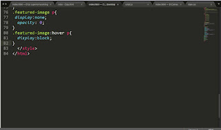
How to display a div on another div hover event? On a CSS hover event, we can change another div's styles. The another div can be either child or siblings. If a div has to be displayed only upon hover, 1) When the child div is inside parent div 2) When both the divs are siblings Read CSS Selectors For displaying div in hover, use :hover selectors. Following link demonstrates the displaying child when parent is hovered. https://jsfiddle.net/CreativeTechnocrayts/grtw44wd/9/ When displaying sibling div, ~ selector is used. (General sibling selector) When displaying an adjacent sibling , + selector is used (Adjacent sibling selector) We can directly select the element by using class or id names. Follow our FB page @CreativeTechnocrayts Subscribe to Creative Technocrayts and be a part of growing community.

Why the container element is not taking the actual height when having floated children?

Image
In frequent case, we may notice that the container element will not grow as per the height of the children. This article deals with the fixes for the solution. The  sample issue is reproduced here for demonstration. https://jsfiddle.net/CreativeTechnocrayts/b1qfp9rz/2/

Points to check before launching website

For anyone who is delivering websites with deadly deadline; there are many chances to miss a few points. To overcome the lag it is better to have a checklist to go through before the launch. When many developers are contributing to the project, it is better to brainstorm and prepare a list to go through at the end. The list may be drawn based on the scope of the project whether the site / application is repsonsive, accessible or print support. File Structuring 1. Supporting files in proper folders (img, css, js, downloads) Maintaining proper project folder structure helps to organize easily and stick to a proper workflow which will avoid conflicts in a team. Header 2. Use a correct Doctype preferably latest version. ( !DOCTYPE html ) You can read here for more information 3. Include Favicons Favicons is a quick identity to our websites. Read on how to implement favicons to our websites. 4. Viewport tag with user-scalable attribute for responsive websites. Viewpo...

The Essential Roadmap for Aspiring Web Developers

A Curated Learning Path for Aspiring Web Developers: HTML, CSS & Design Fundamentals This article has curated essential articles for any aspiring web developer. These articles cover the basics of Web design, HTML, and CSS—the foundational pillars of front-end development. 📚 HTML Fundamentals HTML5 Markup Language HTML5 is the markup language used for creating web pages. This article was written keeping in mind **beginners to web development**. It gives the basic layout of an HTML5 web page followed by a brief explanation of each part. Read more… 📱 Responsive Web Design (RWD) As there are more mobile platforms and devices emerging in the market, making your websites accessible to all clients is very important. Sustaining business through all means is inevitable in this competitive market. An approach of making your websites cust...

Why do we need CSS preprocessor?

Image
CSS Preprocessor CSS Prprocessing by Definition: 1. Preprocessor is any program that process the input data to produce output that can be used as an input for another program. 2. CSS Preprocessor is a processor which gets some instructions or raw code and compiles it into a .css file. When we first step into web development and design, we work with CSS and develop smaller sites and micro sites. As we gain experience and start working in larger application and work in a team, we may come across the word ‘CSS Preprocessing’. When we build bigger application, it is always important to follow ‘Do Not Repeat Yourself’ (DRY) principle and keep our code maintainable and organized . When we hand code CSS, we may have to put in lot of effort and time to achieve the quality results whereas using a preprocessor will automate the processes and scripting tasks. Reasons for using CSS Preprocessor Scalability and architecture When we work in large application we can separate the c...

How to write better maintainable CSS?

When we write CSS especially for a large scale application, we should always keep in mind about maintainability in long run. Every application is subjected to modification and up gradation, so there is no point of starting over from scratch every single time. When we go back to our code base after a long time or adding new members contributing to code base should be able to identify things is in the right place. If we have written a maintainable CSS, updating some minor changes to our repository will not be a daunting one like 1) changing the value for a variable, 2) changing a class name, 3) identifying which modules are written in which section of the code and locate where is the specific line comes from. Only if we incorporate few style guidelines we can easily achieve that. Commenting: As a beginner we should start practicing this point.Commenting the code with proper description is always handy. /*Home page styles*/ /*Home page ends*/ Structuring your CSS file Yo...

How to install custom fonts in CSS? An Overview on Google Web fonts

Image
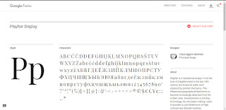
Fonts are a part of website development which emphasizes our brand strategy. We should get better understanding of CSS font family . We are discussing here on how to use custom fonts in our sites and make it browser compatible and across devices. Apart from generic fonts there is lot of custom fonts available which suits our needs. When we go for personal or entertainment websites we may choose artistic fonts and when are working on a company website we may prefer corporate fonts. There are lots of free fonts available either in a .ttf format or .otf format. Font formats .ttf format file stands for True type font and .otf file stands for Open type font. You can install it in your computer. For adding a custom font to our website, we can convert them online using font converter like Font squirrel . It will output the web fonts in different formats like otf, woff,woff2 and svg in order to make the fonts work in different browsers thereby making them compatible and give consiste...