Posts

Showing posts from 2018

Front end development

Image
Wow!! 2018 has been a fantastic year for us, Creative Technocrayts. There has been a satisfying learning curve for us in front end development be it using CSS Flexbox or adapting Google’s AMP in optimisation or designing our websites using Font Awesome 5. We have discussed a lot, thanks to the constant support from the community. We have received both positive feedback and negative criticism as well. Keeping that in mind we strive to improve and learn more and give back to the community. 2018 showed tremendous increasing readership from googleplus community and facebook page apart from Twitter and Linkedin and we are so happy about that. Thank you guys :) Its time for us to look back at this awesome year, 2018!!! Daily UI practice - Range slider and getting the value in jQuery This article, demonstrates how we can style input range, a form elements.It gives you an idea that 1. Input range can be custom styled. 2. Shadow DOM gives selectors to styles input ranges 3. It has trac

Daily UI practice #1 - Input range slider and populating value in script

Image
Daily UI practice Recently I had some time so checked for latest updates in design from awwwards.com I wanted to practice UI for the day. So I picked up a site from there. The reason I picked up that is i) I wanted to learn something new ii) I wanted to do something which I haven’t done before So the exercise was about, Creating a range slider and getting the value Added box-shadow to jumbotron component. Now placing input range elements inside the component, Following bootstrap 4 documentation I got the above screen as it looked like in bootstrap website. I can’t proceed further as I didn’t have any other elements to style. Then I read few tutorials from css-tricks.com What is Shadow DOM? Well, we all know that, when a HTML page is loaded in a browser DOM (Document Object Model) is created. Likewise browsers have capability to create sub tree to the already created DOM elements.   Now we have got two components and customize the styles. They are 1. Track

jQuery practice #3 - DOM manipulation

Image
jQuery is a Javascript framework. When do we use Javascript, jQuery, jQuery UI . DOM Manipulation in jQuery What jQuery does? jQuery is a javascript library, a) access parts of a page b) Modify the apperance of the page c) Alter the content of the page d) Respond to users's iteraction with page e) Add animation to a page Manipulating DOM with jQuery methods 1. To insert new elements inside every method elements, use a) .append() b) .appendTo() c) .prependTo() d) .prepend() Example for .prepend() in jQuery HTML <div class="productsContent one-box"> <div class="box"> <h4> Loreum ipsum1</h4> <p> Neque porro quisquam est qui dolorem ipsum quia dolor sit amet, consectetur, adipisci velit... </p> </div> </div> Prepending an element using jQuery $('.productsContent').prepend('November,2018'); New DOM <div class="productsContent one-box"><span>November,2018&l

How to solve browser compatibility issues in websites?

Image
Websites we develop should always ensure better user experience keep in my mind the tough competition in the market by contemporary players How to solve browser issues in website How our website or web applications looks in different browsers and in different platforms matters the most. We are seeing increase in range of browsers and we may not know from which browser users visit our site. Every browsers have their own way of being an ideal browsers and they have their own features. Making our functions and UI across all the browsers should follow certain guidelines. By ensuring browser compatibility in our SDLC, it would be a safe game to play instead of going about things in the final end. To solve common browser compatible inconsistencies, we are discussing few effective points  here. Browser compatibility for modern browsers Keeping in mind, the cost and time constraints, making sure our websites work for Chrome, Mozilla Firefox, Safari is ideal. Handling common issues

Flexbox CSS justify-content:space-*

Image
Flexbox CSS justify-content:space-* Flexbox layout and its properties are a set of properties which helps to align flex-items in a container. As we have discussed in detail in  our previous articles i) flexbox is a set of properties ii) it helps to align grid elements in a container in may ways iii) it also helps to realign the way it is arranged in a mobile or responsive screen  without writing too much of code. Justify-content Justify-content is the property provided by flexbox concept which works like text-align property. Justify -around takes up the following values justify-content: center | flex-start | flex-end | space-around | space-between | space-evenly justify-content: space-* justify-content: space-* helps us to align flex-items horizontally between the flex-container. In other words, it deals with the horizontal alignment within the container justify-content: space-around space-around helps us to align items in such a way that items have equal space around

What is the difference between Javascript, jQuery, jQuery UI, jQuery mobile?

Image
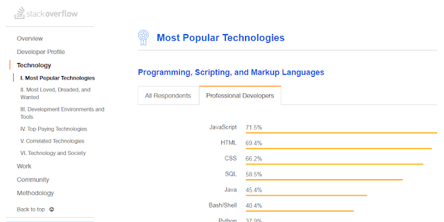
What is the difference between Javascript, JQuery, JQuery UI, JQuery mobile? Javascript Javascript is a programming language with its own syntax, functions, data structures and loops. Javascript is the most popular language used in web development. According to Stack overflow 2018 survey results Javascript is the most popular programming language. It has become an ubiquitous in web development. What is the difference between JQuery and Javascript JQuery is a Javascript library. It is built on top of Javascript and makes use of its functions. Jquery carries the motto “write less; do more”. JQuery is an extensive library making use of Javascript features and function within its library. JQuery framework is useful for 1) Manipulating DOM elements 2) CSS Selectors manipulation 3) Handling AJAX data for communicating with servers perform actions on specific events. 4) AJAX communication with servers 5) Animation effects 6) HTTP requests JQuery is said to have poor backwar

Background image and gradient to the same div in CSS

Image
This article deals with an example to demonstrate how to background-color, background-image and background shorthand property in CSS. You may read this article How to add box-shadow in CSS? How to add Background image to the div     .div1{ background-image: url(../images/bg.jpg); } How to add Background color to the div .div2{ background-color: #0085c2; }     How to add background image and background gradient to the same div? .div2{ background: linear-gradient( rgba(253,29,29,0.6), rgba(252,176,69,0.6) ),url(../images/slide2.jpg); } Instead of background-image or background-color property we have to use background property which is the shorthand rule. Background-gradient and image are separated by comma. The resultant output Also read next article - Is your site mobile friendly?

Boostrap 4 menu align right side in navbar

Image
Boostrap 4 menu align right side in navbar In Boostrap 3 menubar, .navbar-right class is used to bring the menu to the right side.Now .navbar-right class is deprecated. How to align menu to right side using Bootstrap 4 As we already discussed that Bootstrap 4 is built on Flexbox layout , there is change in implementation accordingly. Following code-snippet will highlight the changes in HTML code <nav class="navbar navbar-expand-lg navbar-light fixed-top justify-content-between"> <a class="navbar-brand" href="#">Cafe Express</a> <button class="navbar-toggler" type="button" data-toggle="collapse" data-target="#navbarSupportedContent" aria-controls="navbarSupportedContent" aria-expanded="false" aria-label="Toggle navigation"> <span class="navbar-toggler-icon"></span> </button> <div class=

Font Awesome 5.1

Image
Last time we had a very detailed discussion on Font Awesome 5 and how it stands different from Font Awesome 4.There were three methods to add Font Awesome 5 into our project. Font Awesome 5 can also be downloaded as Web Fonts and used in our local.      style="display:block"      data-ad-format="fluid"      data-ad-layout-key="-bw+m-2t-1d4+2yh"      data-ad-client="ca-pub-9980434921650127"      data-ad-slot="6489306790"> Now Font awesome, has got its new release FontAwesome 5.1.0 with three more categories, 1. Travel 2. Design 3. Emoji We felt awesome after seeing release of Font awesome 5.1 Emoji icons and can’t wait to use in our next project. Font awesome continues to stand apart with large icon base with much better compatibility. All Javascript component packages are now stable. Font awesome 5.1 can be used for React, Angular, Vue and Ember projects. Know the implementation of Font Awesome 5.1.0

CSS Flexbox order

Image
CSS flexbox order Read CSS Display We have discussed CSS Flexbox layout and its related properties with examples in our previous post. Right from the initial stages, ordering the elements has been quite tricky. CSS Flex box ordering emphasizes how useful is flexbox for responsive designing.When attempting to visually order the elements different to that of source code order flexbox order of the elements is very useful. Order of the flex Like direction and alignment CSS flex also provides techniques to define in which order flex elements should display. Order property will work only on the direct flex elements . By default, Order value of all items is zero . Order property can take values of negative, zero and positive. Consider the below example Changing the order of the flexboxes .box-one{ order:4; } .box-two{ order:3; } .box-three{ order:1; } .box-four{ order:5; } .box-five{ order:6; } Changed order of the flexbox items

CSS Flexbox Layout

Image
CSS Flexible box layout Read CSS Display Normally, we achieve the above layout using floats. By using CSS flexbox layout technique we can also achieve the same. But then, why do we need to use CSS Flexboxes technique In a precise answer, 1. Flex layout is an alternative to our ‘floats’ method 2. CSS Flexbox gives us way to control the alignment, direction and order and sizes of the elements placed in the HTML layout. We will look into that in detail one by one in the rest of the article Flex box layout is a set of Basic components of CSS Flex box layout 1. Flex containers 2. Flex Items Browser compatibility CSS Flex is supported by all mordern browsers like Chrome, firefox, Safari, iOS Safari and Opera. Only partial support is extended by IE 11 for CSS Flex as it based on older specifications. Display:Flex We need to make a containing wrapper to flex container. We can do that by CSS, display:flex; Inorder to achieve backwards compatibility, dis

Google's Accelerated Mobile Pages (AMP) HTML

Image
You may read the previous article What is Responsive web design? Like Mobile usability , mobile performance also matters when it comes to appear first in Google search results. Page speed is important Google has announced that from July 2018, Page speed as mobile ranking factor. The announcement has been come in advance so that website owners can revamp their sites accordingly and make sure that their website is performing well. Google business logic behind AMP There are many ad-blockers in usage and many potential players switch from website to web apps. So web advertising revenue of Google might be at threat. So AMP is devised so ads are integral part of the HTML itself. Nowadays, people use apps to search content and apps are comparatively performing faster to web . Google’s main business is based on crawling and indexing of websites and searching content from web and producing it in a readable format. It is also noted that web pages have a drawback of loading speed. Since ap

Mobile usability of websites

Image
Mobile usability of websites Web is pervasive and the way we access to web is constantly changing and change is happening for the better. People are increasingly using smartphones to access sites than desktops and laptops as once they did. So keeping our websites mobile friendly is essential. Mobile usability of websites If you are new to web development how to make websites responsive will give a better idea. Early 2018, Google has announced that websites which are mobile friendly will be ranked for better results in search engine. So it is always better to make sure you have optimized mobile performance to be there in the show! Mobile usability and Responsiveness Websites and content management systems should also be mobile oriented and make users feel ease while accessing. Mobile usability on the whole is a broad concept which includes responsiveness of the site and both are not the same. Responsive site means how well our sites adapt to the width and orientation of the mobi

Implementing Font Awesome 5

Image
Font awesome 5 is an icon set and toolkit making it easy for web designers to add vector icons and social icons to website. We had been using font awesome since 3 version and we have explored version 5 soon after its release. For any websites, Fonts in Websites play an impact in UI / UX. Font awesome is just awesome!! The main reason of Font awesome5 doing great is it is been a popular repository and yet to find a competitor of its par. They provide wide range of icons set. None of the other icon packs provide such versatility and compatibility. Styles of FontAwesome 5 1) Solid 2) Regular 3) Light 4) Brands Font awesome 5 icons Font Awesome 5 comes in two versions : 1) Free 2) Pro Font Awesome5 official documentation states that we may get a Pro license of $60 with 1,718 more icons to the free version of 989 icons. Icons of light styles comes with Pro version Font awesome 5 comes in two formats 1) Web fonts for embedding in our project file. 2) Desktop fonts as