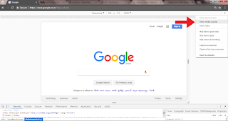
How to make your website responsive?

You may read the previous article What is Responsive web design? Viewport meta tag Making the website responsive across all devices might sound intimidating in the beginning but you will find it at ease as you go along. We may use media queries to make our website responsive but to make it work we must use the viewport meta tag. The viewport meta tag helps to control the width and scale the browser. The width = device-width is applied so the website matches the screen’s width. We can also mention a specified width like, width=”800”. The website will adapt to that specified width. Initial scale =1 is used to fix scaling factor of the webpage. It prevents the default zooming of the page. Using this parameter, responsiveness of the page work. Maximum-scale defines the maximum scale it can be zoomed in. Maximum-scale=1 is the maximum-limit and it won’t allow the user to zoom. User-scalable =1 refers the users zooming in and out of the web page. If you want to disable zooming you can...