Posts

Showing posts from 2017

Becoming a front end developer in 2017

This article has curated articles for any aspiring web developer. These articles are basics of Web designing / HTML / CSS HTML5 markup HTML5 is a markup language used for creating web pages. This article was written keep in mind beginners to web development. It gives the basic layout of HTML5 web page followed by brief on each part. Read more… Responsive web design As there are more mobile platforms and devices emerging in the market making your websites  accessible to all the clients is very important. Sustaining the business through all means is inevitable  in this competitive market. An approach of making your websites customer approachable, interactive  and better experience is responsive web design. Things to keep in mind if you aim for better responsiveness:              Font sizes across all mobile devices           Grid layout in desktop versus meaningful stackin...

Why do we need CSS preprocessor?

Image
CSS Preprocessor CSS Prprocessing by Definition: 1. Preprocessor is any program that process the input data to produce output that can be used as an input for another program. 2. CSS Preprocessor is a processor which gets some instructions or raw code and compiles it into a .css file. When we first step into web development and design, we work with CSS and develop smaller sites and micro sites. As we gain experience and start working in larger application and work in a team, we may come across the word ‘CSS Preprocessing’. When we build bigger application, it is always important to follow ‘Do Not Repeat Yourself’ (DRY) principle and keep our code maintainable and organized . When we hand code CSS, we may have to put in lot of effort and time to achieve the quality results whereas using a preprocessor will automate the processes and scripting tasks. Reasons for using CSS Preprocessor Scalability and architecture When we work in large application we can separate the c...

How to write better maintainable CSS?

When we write CSS especially for a large scale application, we should always keep in mind about maintainability in long run. Every application is subjected to modification and up gradation, so there is no point of starting over from scratch every single time. When we go back to our code base after a long time or adding new members contributing to code base should be able to identify things is in the right place. If we have written a maintainable CSS, updating some minor changes to our repository will not be a daunting one like 1) changing the value for a variable, 2) changing a class name, 3) identifying which modules are written in which section of the code and locate where is the specific line comes from. Only if we incorporate few style guidelines we can easily achieve that. Commenting: As a beginner we should start practicing this point.Commenting the code with proper description is always handy. /*Home page styles*/ /*Home page ends*/ Structuring your CSS file Yo...

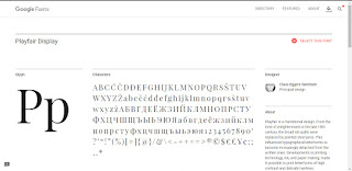
How to install custom fonts in CSS? An Overview on Google Web fonts

Image
Fonts are a part of website development which emphasizes our brand strategy. We should get better understanding of CSS font family . We are discussing here on how to use custom fonts in our sites and make it browser compatible and across devices. Apart from generic fonts there is lot of custom fonts available which suits our needs. When we go for personal or entertainment websites we may choose artistic fonts and when are working on a company website we may prefer corporate fonts. There are lots of free fonts available either in a .ttf format or .otf format. Font formats .ttf format file stands for True type font and .otf file stands for Open type font. You can install it in your computer. For adding a custom font to our website, we can convert them online using font converter like Font squirrel . It will output the web fonts in different formats like otf, woff,woff2 and svg in order to make the fonts work in different browsers thereby making them compatible and give consiste...

How to add box-shadow in CSS

Image
Box- shadow property is a Cascading style sheet property which helps to cast shadow for an element. When you draw an image you shade the shadow with a pencil. When you work in code, you apply an inner or outer shadow to the element with box-shadow property. You can find the below picture of pencil shade and cascading style sheet method of implementation.  Looks cool nah!

HTML5 Markup - Why should we use HTML5?

HTML5  is a markup language used for structuring and presenting content on the World Wide Web. Its fifth version is the currently used stable version. You might have read about the HTML hierarchy in the previous article. This article will walk through the basic HTML5 code and explain the elements. <!DOCTYPE html> <html lang="en"> <head> <meta charset="utf-8" /> <title>Creative Technocrayts/title> <link rel="stylesheet" href="css/main.css" type="text/css" /> <!--[if IE]>   <script src="http://html5shiv.googlecode.com/svn/trunk/html5.js"></script><!...

How to make your website responsive?

Image
You may read the previous article What is Responsive web design? Viewport meta tag Making the website responsive across all devices might sound intimidating in the beginning but you will find it at ease as you go along. We may use media queries to make our website responsive but to make it work we must use the viewport meta tag. The viewport meta tag helps to control the width and scale the browser. The width = device-width is applied so the website matches the screen’s width. We can also mention a specified width like, width=”800”. The website will adapt to that specified width. Initial scale =1 is used to fix scaling factor of the webpage. It prevents the default zooming of the page. Using this parameter, responsiveness of the page work. Maximum-scale defines the maximum scale it can be zoomed in. Maximum-scale=1 is the maximum-limit and it won’t allow the user to zoom. User-scalable =1 refers the users zooming in and out of the web page. If you want to disable zooming you can...

What is Responsive web design ? - A Beginner's Guide

Image
Responsive web design In today's digital age,there are more mobile platforms and devices emerging in the market. Therefore making our websites accessible to all the clients is very important. As web developers we have the responsibility to develop websites which is adaptable to web platforms and devices of all variations.. An approach of making our websites customer-centric, interactive & adaptive and at the same time providing rich user experience is responsive web design.